Event Branding Project
The Run Down
This was a school project that was based on creating our own custom 16-page magazine. I had the idea to expand on my previous work, that being the Event Branding Project, and using some of the assets and styling to design a sort of "what if" scenario around the brand. What if the made-up company, The Black Letter, had a monthly magazine? I used this to frame much of my thinking when designing the magazine's original layout and its contents. Similar to my previous work, I wanted this magazine's focus to be around tabletop games, with the aesthetics of modern black-letter and contrasting colors to draw the eyes. Before I had gotten much of the layout finished, I had the idea of each month having a "tabletop game of the month" that the company would review. This ended up being my main piece in the magazine. I would also later develop a section directed towards upcoming releases of new tabletop games and some secondary articles discussing news and controversies.
The Process and Layout Design
Second Spread

The process for making the magazine was split into several chunks. I started by making the layout on basic printer paper, essentially making a mock-up of the design. In the end, I was left with a small, handbook-sized replica of my ideas put to paper. This helped me to visualize how exactly I was going to lay each page out and where I was able to place advertisements.
The Main Piece

First Spread
The next step for me was to design and finish my main article. This was the first of many smaller projects that this magazine was composed of. I decided to frame my main article by making the only thing someone could look at when they flipped the page. I wanted it to be bold and loud. I would use a total of 4 pages to design the final layout, the first two consisted of a full spread layout of the title of the tabletop game I had chosen (This being Mothership,) and styling the spread to the game. For this I decided to have the main logo in the center of the spread, spanning both pages. I then made a small description on the bottom of the page to draw the reader in. Then, when they flipped the page, they would be met with another full page spread of a detailed breakdown of the tabletop game and its various systems.
Designing the New Releases
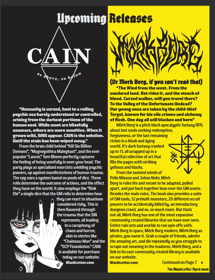
One other major part of my magazine was the "New Releases" section. This was where I would show off upcoming tabletop games and give small explanations of what they were and where to get them. To make it simple, I decided on my fake company also having a fake website where you could purchase any of the games they talked about in each issue. For each section of the new releases, I would customize a portion of the page to fit the styling of the game I had shown off. This led to some very fun-looking pages and a lot of bright colors. For the selection process of what games to show off, I wanted a wide variety that people could pick from, but I also wanted to choose games that were more art-focused in their design. This allowed me to play with the page and text wrapping more for each section, livening up the page.
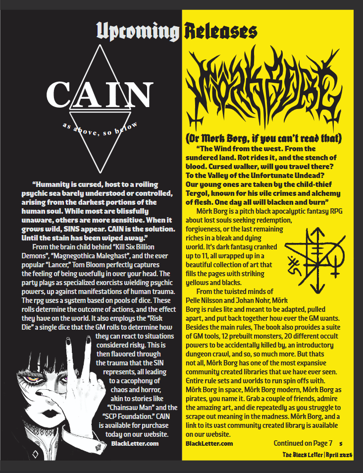
To the right is an example of my personal favorite of all of the release pages I made. The coloring and use of text wrapping are some of my favorites in the entire magazine. This section also took up much of the magazine, and taught me a lot about how to construct a simple 2-panel layout, while still keeping it fun and creative each time. A major challenge I ran into early on was formatting the text to work for each page layout. Because of the heavy use of text wrapping throughout the entire magazine, Much of the text had to be reformatted multiple times in order to remove the occasional widow or strange sentence layout. This would turn into a recurring problem later on the line as I made more and more pages.
The advertisements

Advertisements were the next beast I would tackle in this project. I had decided early on to only do full-page ads. This was mainly to keep the focus of each page on the content of the magazine and not the advertisement funding it. That said, this made each advertisement much harder to do, as they had to fill a larger space and take up more of the page, without looking barren and boring. I succeeded in doing this by keeping each advertisement varied and interesting to look at, while still conveying the necessary information. Each one was designed with the company's style in mind, while still providing my own small twists on each one to better align each ad with the rest of the magazine.
Secondary Pages and Cover
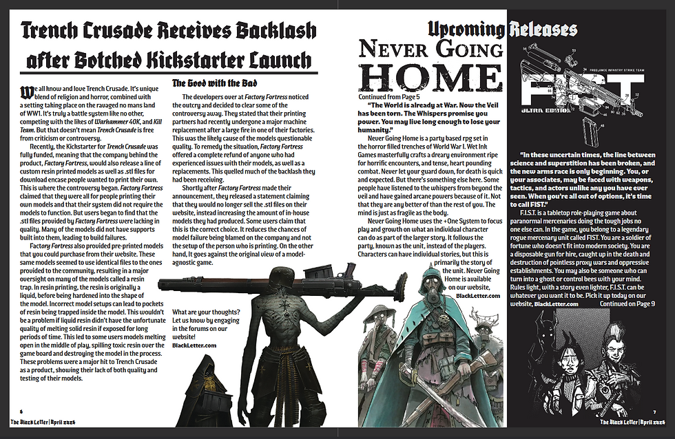
The secondary pages consisted of more word-focused designs. Articles about news and controversies would have less of a focus on the art to give room for the words to speak. For these layouts, I used simple 2 or 3-panel layouts and left much of the room on the page open for text. Even then, I never left the page empty of style. A goal of mine in this project was to make each page interesting to look at, whether it was an ad or not; there had to be something interesting about the page. To achieve this in this section, I would always add a simple shape or image to wrap the text around. It didn't have to be big, but that small change in style compared to a flat page full of text makes a world of difference.
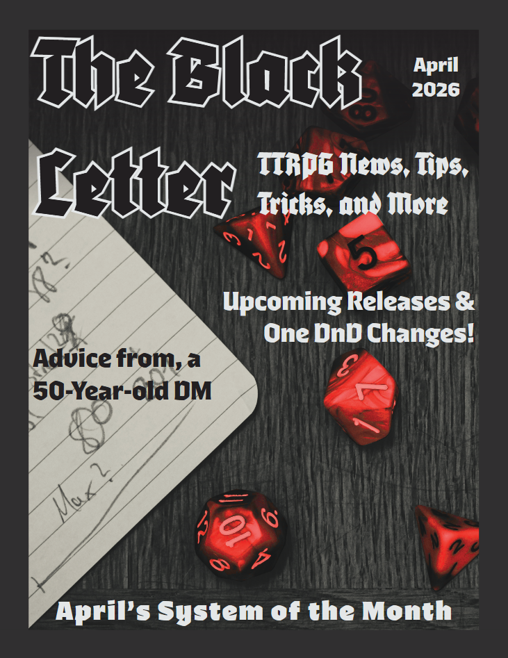
Regarding the front cover, I took a similar approach. I wanted the front cover to be stylish and flashy, without giving away too much of what was inside the magazine. To do this, I went with a simpler design, using major headlines and a splash of red to catch the viewers' eyes.
Closing Thoughts
This may be one of the coolest things I've ever designed. I LOVE how the entire magazine turned out. From front to back, it is nearly identical to the layouts and ideas I had in my head, made physical and put on paper. Throughout the entire process, I learned a ton of new things about the entire Adobe suite, giving me a much tighter grasp on InDesign as a program, as well as a deeper understanding of Photoshop and Illustrator to boot. I'm incredibly proud of this work and how it turned out in the end, if you would like to read the full thing in PDF form. Click the link below!